
Mimosa’s bold and unique label allows it to sell out in weeks; proves that consumers shop eyes first
How A Trip To Aldi Turned Into A Case Study
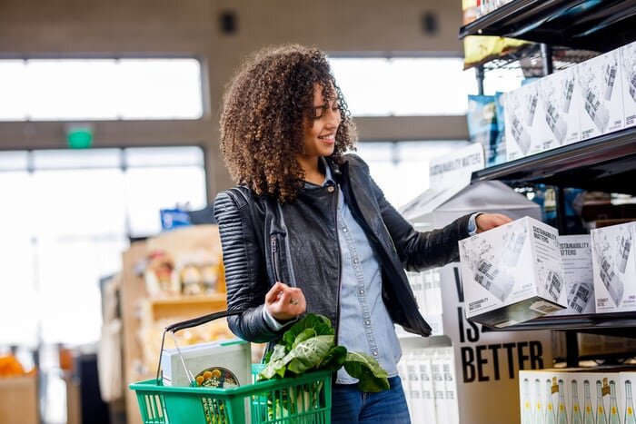
Recently, a Tango teammate was shopping at a local Aldi, as she does for all her grocery needs, when something caught her eyes. Now mind you, she reported that her and her husband don’t usually consume alcohol, so whenever they pass through the wines and spirits section, they don’t meander for too long. But this time, something stopped her in her tracks.
A bright yellow shrink sleeve label amongst a sea of muted pressure-sensitive labels demanded for her attention. And her attention was what it got.
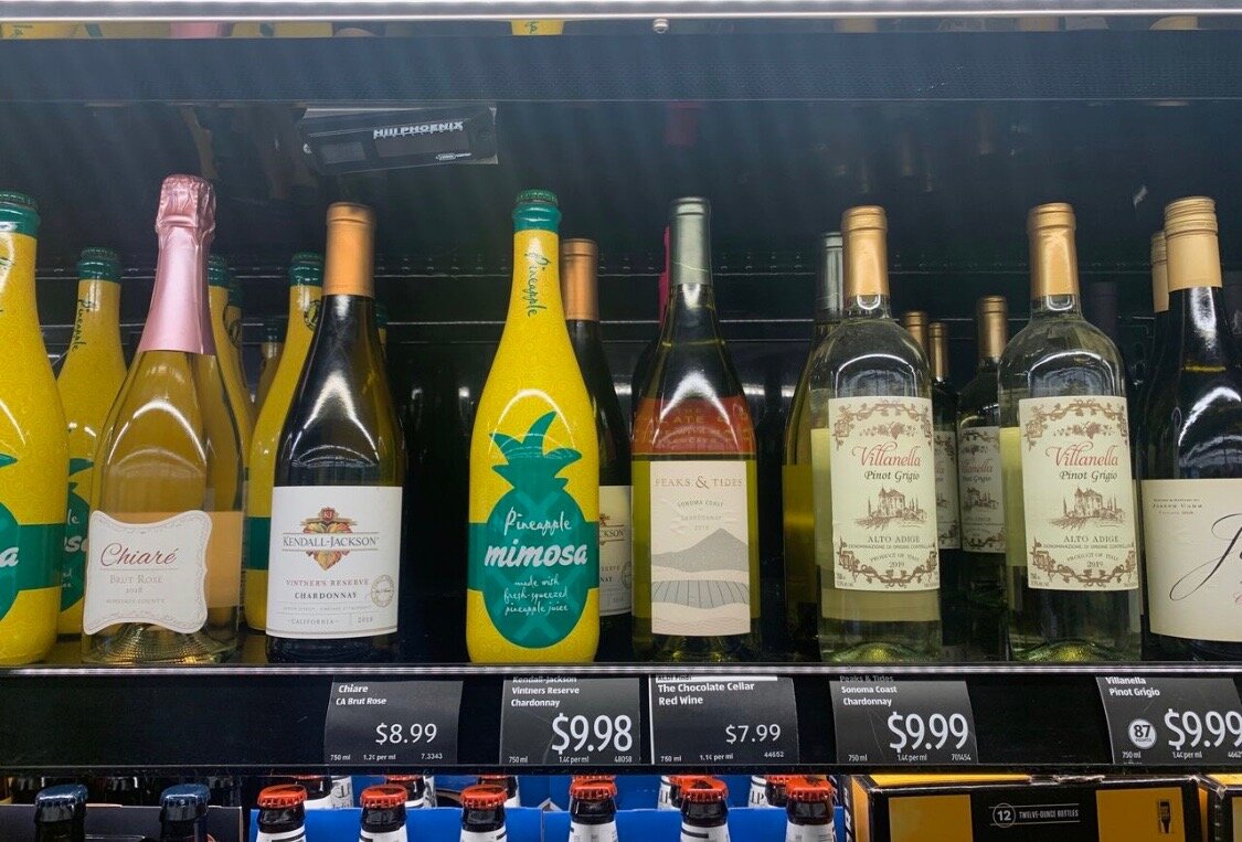
She wasn’t looking for Pineapple Mimosa when she stepped into Aldi that evening, but this unique and beautiful label won her over simply because of it’s eye-catching display.
But do all consumers think like our Tango teammate? Are we all easily won over by labels with aesthetic designs and colors?
For the most part...YES!
And to prove it, she returned just a few days later, partly to restock her fridge for her ravenous husband, and partly to check in on the beautifully-labeled mimosas.
She was pleasantly surprised to find that they were all gone, sold out completely from the store! The other monotone pressure-sensitive labeled products, on the other hand, were still there.
Studies Show Consumers Purchase With Their Eyes
While she was pretty excited to see this Mimosa sell out in a matter of weeks, it came as no surprise to the rest of our team at Tango.
See, you may have heard the saying “you eat with your eyes,” but the same is true about consumers’ purchasing behavior. We “buy” with our eyes before we buy with our wallets.
According to Packagingstratagies.com, 53% of consumers say that brightly colored logos and labels catch their attention more than brand names. The study also showed that a surprising 37% of consumers won’t purchase a product if it has unappealing photos on its label.
The Institute of Color found that 85% of customers’ first impressions of a product on a shelf come from color alone!
A study by Luminer.com concluded that 33% of consumers will entirely reject a product simply because they disliked the label and logo.
This means that a third of all consumers aren’t reading information, analyzing prices, or weighing the benefits of a product. Rather, they’re caught up in the aesthetics of the packaging.
Yet, there are still countless companies out there overlooking the importance of label design. Instead, they stick with their old-school ways and hope that consumers will find them.
Madeforprint.com believes that this strategy is often detrimental for a product's success. They state that a mere 7 seconds is all it takes for consumers to decide which product they are going to purchase, and this decision is almost always controlled by the product’s packaging.
A product’s label has just 7 seconds to win a consumer.
How To Create A Label That Can Win In 7 Seconds
Like we talked about earlier, your product is going to compete with hundreds of others. And with only 7 seconds to grab consumer’s attention and convince them to purchase, your label needs to make a statement.
Here are some things to keep in mind when creating a label to win consumer dollars:

1. Utilize Unique Color and Texture - These are critical in designing an eye-catching label. Using a unique and bold color (just like the Mimosa in this blog) will automatically distinguish your product from the sea of competitors. Unusual texture, such as matte or gloss, also allows for differentiation. Observe what the competitors in your market are doing with color and texture, then strive to be different. Utilizing color and texture, your product is guaranteed to stand out in those crucial 7 seconds of consumers' decision making. HOWEVER, we don’t want to totally rule out the magic of MINIMALISM either. Often a minimal design strategy can be just as effective as the bright and bold designs. The key to figuring out which path to take with your label design? Look at your competitors! What are they doing? It might be time to try something different from them. After all, differentiating will be the biggest key to winning consumer eyes first.

2. Invest in High Quality Labels - Middle age and younger consumers care more about the quality of a product than the price of it. These consumers often associate the quality of the packaging with the quality of the contents inside. If you want your consumers to trust the quality of your product, invest in high-quality packaging.
3. Use Labels With Enough Real Estate - Between designs, images, your company's logo, and all the FDA required information, a great deal of space is demanded on your product’s label. Still, it’s important not to sacrifice font size or overall aesthetics. The best labels are able to include all the above information in an easy-to-read font size for their consumers. The key? Using labels that offer enough room. Full-body and full-body over-the-cap shrink sleeves are great solutions for companies that need labels with plenty of real estate.

Back To The Beginning; The Mimosa That Inspired It All
To wrap up this blog, we reflect once again on the beautifully and boldly labeled Pineapple Mimosa from Aldi.
Perhaps the label was not the only factor that caused the bottles to sell out so quickly, but after examining all the statistics above regarding consumer purchasing decisions, we’re pretty confident that the label played a large part in the product’s success.
Our Tango teammate left her second trip to Aldi with one thought resonating in her mind: Consumers truly do shop with their eyes first.